News Guide
Dashboard
http://cns.utexas.edu/news/dashboard/
Read More...
This function creates the sub-head for each blog post. Please put the first sentence of the story at the top of the page, then the “Read More” below that. Any images should fall below the Read More line.
Sometimes the Read More will insert more spaces than needed. Double check the published post and adjust if needed.
Press release posts will no longer include location information, e.g.,“AUSTIN, Texas,” in the first line.
Tags and Categories
Categories are the 11 departments, College & Campus (for general news or news that crosses departmental boundaries), In the News, and Kopp’s Weekly.
Please use existing tags for everything else. If we are going to add tags, let’s evaluate as a team.
Images For News
When uploading images into the content area, use the Media Manager. Every news item should also have a featured Blog Image (this is the image that appears in the Feature Tray and in the list view as a thumbnail.
Notes on the Media Manager:
- Click on “Insert Media” and choose to either “Upload media” or “Choose Media.”
- When uploading, it may default to your My Media folder. If so, click on “Change Upload Folder” and change to Shared Media.
- Store all images in the Shared Media (easyblog_shared folder) and the appropriate date sub-folder, e.g. 2013.
- You can resize the image by clicking on the image and clicking “Customize.”
- Under Available Sizes, always use the “Original” image, not the “Thumbnail.”
- Here, you can add a caption if needed.
- You can also constrain the image to 350 px wide using the “Enforce Image Dimension.”
Featured Blog Image
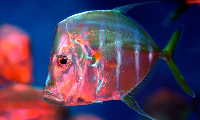
Dimensions: 5x3, recommended: 700 x 420 px, 72 dpi
Alignment: N/A
Example (after rendered by the news blog):
Content: Full Wide
These are images that span the entire content space on the page. Use good images. Use the Media Manager to insert.
Dimensions: 700 x 420 px, 72 dpi
Alignment: (None); One carriage return after the image to create space between image and text.
Example:

Content: Standard/Other
These are images inside the content that are left or right justified. Use the Media Manager.
Preferred dimensions: 5x3 or 3x5, same as Featured Blog Image, but not required
Original image: Can be 700px wide (same as Featured Blog Image), 72dpi, and should be no larger than 150-200K file size.
Formatted for post: Adjust to 350 px wide
Left align: Padding (Right 15, Bottom 10)
Right align: Padding (Left 15, Bottom 10)
NOTE:If using a caption, do not adjust padding! It will mess up the caption formatting.
Video for News
Use the Embed Video function.
Embed at 350 px wide or Full Wide (700 px) depending on content
Previous videos: leave dimensions as is
CAUTION: The editor will often insert code that forces a smaller font size and line height. Please keep an eye out for this and remove the offending code from the HTML.
Tabs and Sliders Guide
Tabs
To use tabs, use the following shortcode to start the tab content but use curly braces "{}" instead of the square braces "[]" shown below.
[tab First Title Tab]
Tabs are closed with the [/tabs] tag.
refer to additional documentation here: http://www.nonumber.nl/extensions/tabs
Sliders
Sliders use the same shortcode syntax, just with "slider" instead of "tab". To use the slider, use the following shortcode to start the tab content but use curly braces "{}" instead of the square braces "[]" shown below.
[slider First Title Tab]
Sliders are closed with the [/sliders] tag.
by default the first slide will be open. To change this add the following to the first slide code.
[slider Slide Title|closed]
Notice the bolded '|closed' above, this will keep the first slide closed.
refer to additional documentation here: http://www.nonumber.nl/extensions/sliders
Image Guide
Feature Images
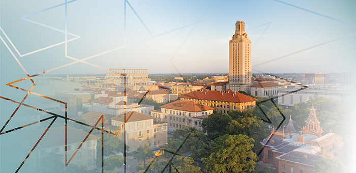
These are the images used in feature sliders or across the top of a 2-column page
Dimensions
- 700 x 340 px
- 72 dpi
- Alignment: N/A
Example:
Sidebar Images
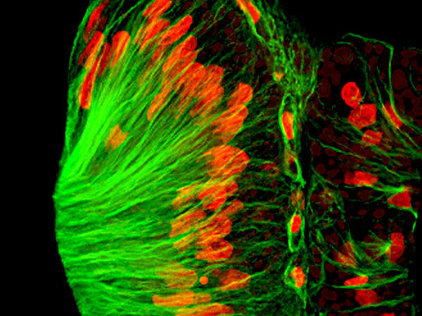
Dimensions
- 3x4 or 4x3
- Vertical: 600 x 800 px
- Horizontal: 600 x 450px
- 72 dpi
- Alignment: N/A
Note: When creating the sidebar “Explore” image with the color overlay caption, always use horizontal orientation for the image.
Page Images
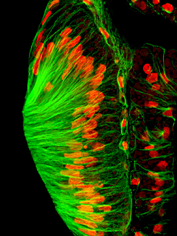
When not using a sidebar, but rather inside a page.
Dimensions
- 3x4 or 4x3
- Vertical: 600 x 800 px
- Horizontal: 600 x 450px
- 72 dpi
- Published size: Adjust to 225 px wide
- Alignment: Left or Right depending on need
- Left align: Padding (Right 15, Bottom 10)
- Right align: Padding (Left 15, Bottom 10)
NOTE: If using a caption, do not adjust padding! It will mess up the caption formatting.
Main Homepage Feature Image
Dimensions
- 2000 px x 1600 px
- 5:4 ratio will look the best
- Less than 1MB max file size


